In MS Excel, you have a lot of tools for you to improve your work at your discretion. One of these tools is Graphs/Charts.
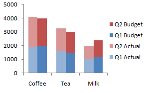
![](https://blogger.googleusercontent.com/img/b/R29vZ2xl/AVvXsEimVK_BM62gu2uqm_t5agMtTNOTAolmcRpWVZpr1EMpRazFf69W7x5A-QWVInJNkfgP6vFHfGnYl99OOnPLu8Xd5RGUeVE04vtaik4L8Z9-P-tKokdIvor0nBj9HtaAp-fnousY0I79ZNUI/s1600/CS_Col_00.png) |
Column Chart |
We have certain types of graphs to use. These are:
- Column Charts
- useful for showing data changes over a period of time
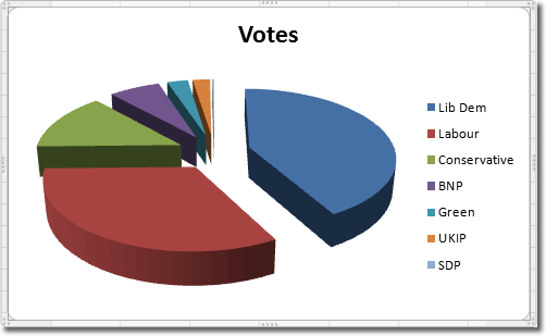
![](https://blogger.googleusercontent.com/img/b/R29vZ2xl/AVvXsEjAUW1X2nApn5pFliJGvgd7s130ZrBwW6eTae44VplG-BeZbLlrqKc3izm4FxRn3SDrzyH1luab9j-FNE47nlRlGJuvbaZ6ZSfbwOYwjuNYfJj0uzjSK_NbSyhqeI36rMZWGiH-lfhNcFqI/s1600/3-d-pie-chart-in-excel-2010.gif) |
Pie Chart |
- Pie Charts
- show the size of items on one data series, proportional to the sum of items
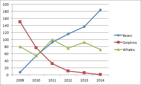
![](https://blogger.googleusercontent.com/img/b/R29vZ2xl/AVvXsEjtt80fkyP7JngrFg4NyN3-RUuv150Hmzl05Lv2IndjkAaydBC0SEtz30gZWDvtlG9c6l_YWq6ySWHl5FnziY6v_KhxJbpQqnOKzevHXLYlQuEor0hB84n_j1AjSW1_AO_J_qXUtOaPiQb7/s1600/line-chart.png) |
Line Chart |
- Line Charts
- display continuous data overtime, set against a common scale, and are therefore, ideal for showing trends in data at equal intervals.
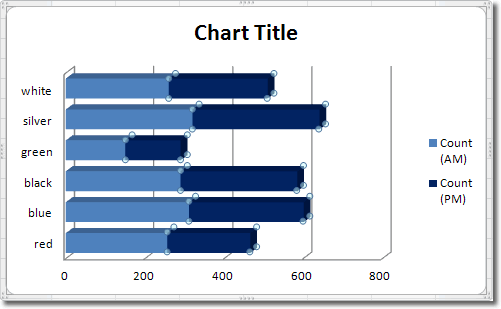
![](https://blogger.googleusercontent.com/img/b/R29vZ2xl/AVvXsEgz7LUl3pAcjX6af3qiiBbKXOdjyM_9baDfvTxFmErBRwGzbCB0zPPD8l5vdaI2Z1SHcMF0NOB_KR4CE8mjhHy7xglmtWP7Gv56d70hWpU7OOd3nlhTwFE5oilvhd6kha-LuDLh3BXOLdso/s1600/bar-colours.gif) |
Bar Chart |
- Bar Charts
- illustrate comparisons among individual items
- When to Use:
- the axis labels are long
- the values that are shown are durations.
And there are plenty more charts such as:
- Stock Chart
- Area chart
- Doughnut Chart
- Bubble Chart
- Radar Chart
- Surface Chart and
- Scatter Chart
No comments:
Post a Comment